
Free learning resource
Canva Design Starter Kit
A practical beginner-friendly guide to Canva design that teaches you the fundamentals of typography, color, layout, visual hierarchy, spacing, image selection, and professional design workflow.
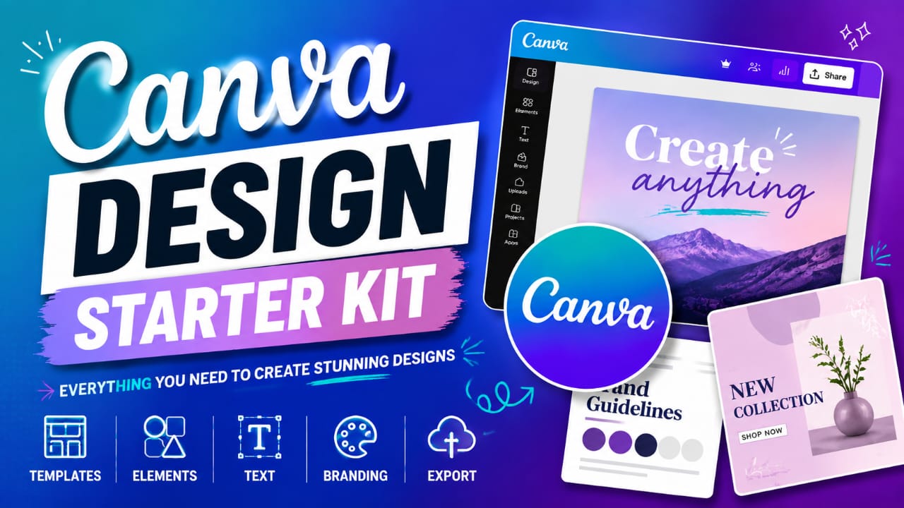
CANVA DESIGN STARTER KIT
Your Beginner's Guide to Creating Better Designs with Canva
By Daveka Academy
Welcome to the Canva Design Starter Kit
Welcome to the Canva Design Starter Kit by Daveka Academy.
Canva makes graphic design accessible to almost everyone. You don't need to be an expert designer to create professional-looking social media posts, flyers, presentations, business graphics, or marketing materials.
This starter kit will help you understand the basic principles behind good design and give you practical guidance you can immediately apply in Canva.
Your goal isn't to make complicated designs. Your goal is to communicate clearly and professionally.
1. Understanding the Basics of Design
Before opening Canva, understand these five principles:
1. Contrast
Contrast helps important elements stand out.
You can create contrast through:
- Light vs. dark colors
- Large vs. small text
- Bold vs. regular fonts
- Different shapes
- Different sizes
Tip: Your headline should usually stand out from supporting information.
2. Alignment
Don't place elements randomly.
Make sure your:
- Text
- Images
- Shapes
- Logos
- Icons
have a visual relationship with one another.
Good alignment immediately makes a design look more organized.
3. Hierarchy
Visual hierarchy tells people what to look at first, second, and third.
A simple hierarchy could be
MAIN HEADLINE Supporting statement Additional information CTA
Your most important message should receive the strongest visual emphasis.
4. Balance
Balance prevents one side of your design from feeling unnecessarily heavy.
You can use:
- Images
- Text
- Shapes
- White space
to distribute visual weight.
5. Consistency
If you're designing for a business or brand, maintain consistency in:
- Colors
- Fonts
- Logo placement
- Image style
- Design elements
Consistency helps people recognize a brand.
2. The Power of White Space
One of the biggest mistakes beginners make is trying to fill every available space.
Don't.
White space gives your design room to breathe.
Instead of asking:
"What else can I add?"
Ask:
"What can I remove?"
A clean design is often more effective than a crowded one.
3. Choosing the Right Fonts
You don't need 10 different fonts to create a great design.
Start with two fonts:
Font 1 — Heading
Use it for:
- Headlines
- Titles
- Important statements
Font 2 — Body
Use it for:
- Descriptions
- Supporting information
- Small details
Simple rule
Maximum 2–3 fonts per design.
Avoid using too many decorative fonts because they can make your design difficult to read.
Beginner-Friendly Font Combinations
Try combinations such as the following:
Montserrat + Open Sans
Poppins + Lato
Playfair Display + Montserrat
Bebas Neue + Poppins
DM Serif Display + Open Sans
4. Choosing Colors
Color communicates emotion and helps establish brand identity.
Here are some common associations:
| Color | Common Association |
|---|---|
| Blue | Trust, professionalism, reliability |
| Green | Growth, nature, health |
| Red | Energy, urgency, passion |
| Yellow | Optimism, creativity, attention |
| Orange | Enthusiasm, friendliness |
| Purple | Creativity, luxury |
| Black | Elegance, authority |
| White | Simplicity, cleanliness |
These associations aren't absolute, so always consider your audience and brand.
The 60–30–10 Rule
A simple starting point:
- 60% — Dominant color
- 30% — Secondary color
- 10% — Accent color
You don't have to follow this mathematically. Use it as a guide for creating visual balance.
5. Choosing Images
A good image can strengthen your message.
When selecting images:
- Choose clear, high-quality images.
- Make sure the image matches your message.
- Avoid unnecessary visual clutter.
- Consider the direction people are looking.
- Use consistent image styles when creating a brand.
Remember:
A beautiful image that doesn't support your message is still a poor design choice.
6. Canva Design Sizes You Should Know
Different platforms require different dimensions.
Social Media
Instagram Post 1080 × 1080 px
Instagram Story 1080 × 1920 px
Facebook Post 1200 × 630 px
YouTube Thumbnail 1280 × 720 px
LinkedIn Post 1200 × 627 px
TikTok / Short-form Vertical Video 1080 × 1920 px
Always check the current platform specifications when creating important campaign assets, as recommended dimensions can change.
7. A Simple Canva Design Workflow
Use this process whenever you create a new design.
STEP 1 — Define the purpose
Ask:
What is this design supposed to achieve?
Is it meant to:
- Educate?
- Promote?
- Inform?
- Inspire?
- Sell?
- Announce something?
STEP 2 — Identify the main message
Write the most important message in one sentence.
STEP 3 — Choose your format
Select the correct Canva dimensions.
STEP 4 — Choose your visual direction
Decide:
- Colors
- Fonts
- Images
- Style
STEP 5 — Create the hierarchy
Place the most important information first.
STEP 6 — Add supporting information
Keep secondary information smaller and simpler.
STEP 7 — Add your CTA
Tell the audience what to do next.
Examples:
REGISTER NOW
LEARN MORE
DOWNLOAD FREE
CONTACT US
BOOK YOUR SESSION
STEP 8 — Review
Before downloading, check:
- Spelling
- Alignment
- Readability
- Spacing
- Colors
- Logo
- Contact details
8. The 5-Second Test
Before publishing your design, look at it for approximately five seconds.
Then ask yourself:
What did I notice first?
If the answer isn't your main message, your visual hierarchy may need improvement.
Also ask:
Can someone understand what this design is about without reading every word?
If not, simplify it.
9. Common Canva Mistakes to Avoid
❌ Too much text
A graphic is not a document.
Keep the main design focused and move detailed information elsewhere when possible.
❌ Too many fonts
Multiple fonts can make a design look inconsistent.
❌ Too many colors
Choose a controlled color palette.
❌ Poor contrast
Make sure text is clearly visible against the background.
❌ Low-quality images
Blurry images make a design look unprofessional.
❌ Random alignment
Use Canva's alignment tools and guides.
❌ Overusing effects
Shadows, glows, outlines, and animations should support the design—not overwhelm it.
❌ Copying everything into one design
You don't need every piece of information on one graphic.
Simplify.
10. Your Beginner Canva Checklist
Before downloading your design, check each item:
- Is the main message clear?
- Is the headline easy to see?
- Are the fonts readable?
- Have I used too many fonts?
- Are the colors consistent?
- Is there enough white space?
- Are the elements properly aligned?
- Are the images high quality?
- Is the CTA clear?
- Is the logo correctly placed?
- Have I checked spelling?
- Have I checked phone numbers and links?
- Is the design suitable for its platform?
- Does the design communicate its purpose quickly?
11. Your First Canva Practice Project
Now it's time to practice.
Challenge: Create a Social Media Quote Graphic
Create a square 1080 × 1080 px design.
Include:
Headline: "Your Growth Begins With What You Choose to Learn."
Supporting text: "Invest in your skills. Build your future."
CTA: "Start Learning Today"
Your design should include:
- 2 fonts
- 2–3 colors
- One relevant image or graphic element
- Clear hierarchy
- Plenty of white space
- Your own creative layout
Don't try to make it perfect.
Create. Review. Improve.
That's how you develop design skills.
12. Your 7-Day Canva Practice Challenge
Day 1
Create a motivational quote graphic.
Day 2
Create a promotional flyer.
Day 3
Create an Instagram carousel.
Day 4
Create a business announcement.
Day 5
Create a YouTube thumbnail.
Day 6
Create a simple personal-branding graphic.
Day 7
Redesign your Day 1 design using everything you've learned.
Compare both versions.
You'll probably notice a difference.
BONUS: The Daveka Design Formula
When you're unsure where to start, remember:
MESSAGE → HIERARCHY → COLOR → TYPOGRAPHY → IMAGE → SPACING → CTA
Don't start by adding random elements.
Start with the message.
Then build the design around it.
Final Thought
You don't become a good designer by simply learning where every Canva button is.
You become better by learning how to communicate visually.
Start simple.
Practice consistently.
Study good designs.
Create your own.
Then improve them.
Your first design doesn't need to be perfect. It needs to be your first step.
Ready to Go Further?
This starter kit gives you the foundation.
If you want to move from Canva beginner to confident designer, explore the practical design training available through Daveka Academy.
Learn. Create. Improve. Grow.
Daveka Academy
Empowering People With Practical Digital Skills.